1. Booking is one tap away
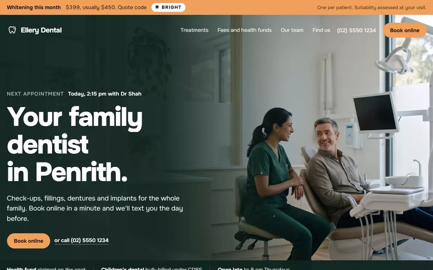
A Book online button sits at the top of every page and follows the patient as they scroll, so they can book the moment they decide. On a phone, the phone number is tap-to-call.
2. The first screen says who, where and what
In a few seconds a visitor should know it is a dental clinic, which suburb it is in, and that they can book. A clear heading like "Your family dentist in [suburb]" beats a clever slogan.
3. Real photos of the team and rooms
Patients want to see who will treat them and what the clinic looks like. Real photos build trust far faster than stock smiles.
4. A clear page for every treatment
Check-ups, children’s dentistry, implants, emergency care and whitening each get their own page, explaining what happens, how long it takes and a "from" price if you show prices. These pages are also what people find on Google.
5. Fees, health funds and payment options up front
Cost is a top worry. Show which health funds you claim on the spot, whether you bulk-bill under the Child Dental Benefits Schedule, and any payment plans.
6. Emergency help that is easy to find
Someone with toothache at 9 pm needs to know what to do now. A clear emergency section with after-hours instructions wins patients who often stay for years.
7. Wording that fits Ahpra’s rules
No clinical testimonials, no "best" or "pain-free", and the terms shown with every offer. Good dental sites read calm and clear, not salesy.
8. Fast on a phone
Most patients look you up on a phone. Pages should open in a couple of seconds and be easy to read and tap with one thumb.
9. Set up for local searches
Opening hours, address and services set up so Google understands you are a dentist in a particular suburb, which is how you appear in local results and on maps.
10. Something that keeps patients coming back
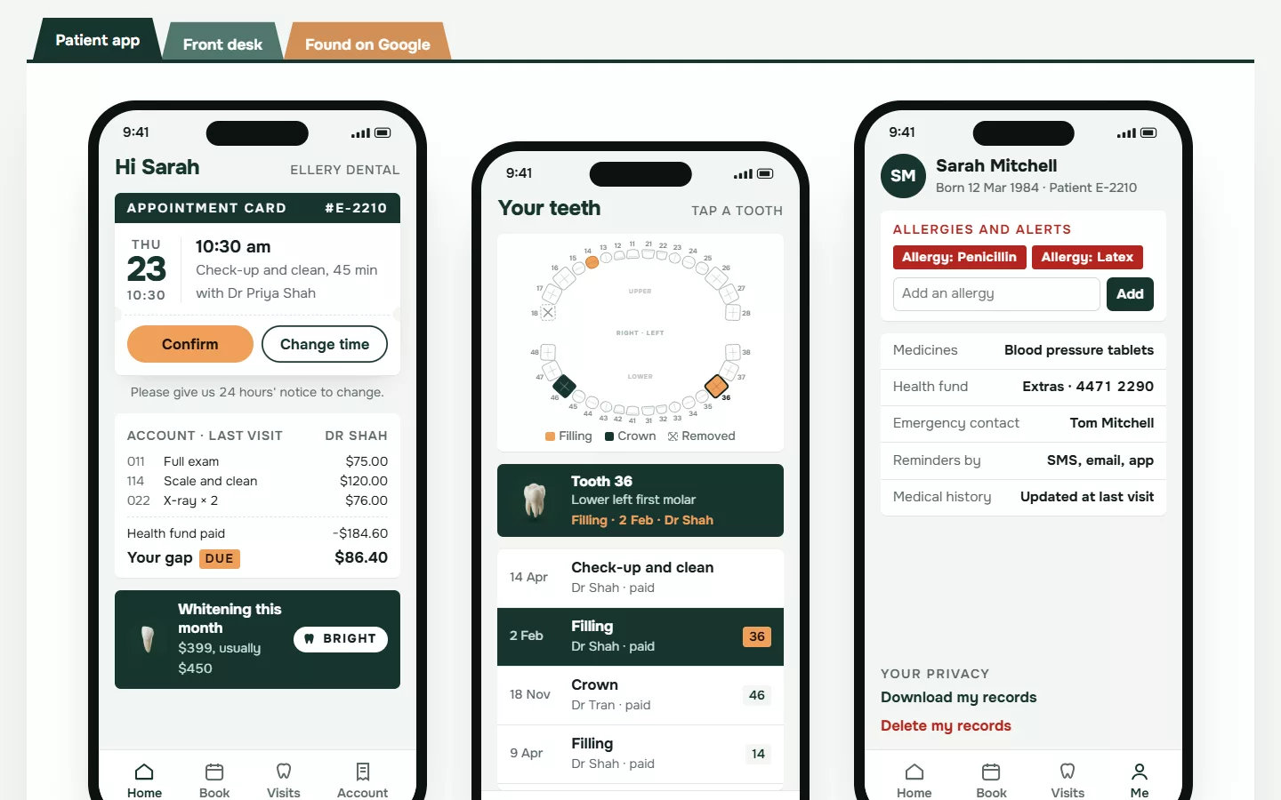
The strongest clinics go beyond the website: reminders, a patient app with the next appointment and what is owed, and alerts that fill cancelled appointments.